
A 50-year-old framework that is still relevant to our design exploration
A more deliberate and practical approach to exploring new ideas

🕰️ Est. reading time: 4 minutes

There's no one-size-fits-all approach to exploration.
We all have our own ways of doing it.
My process usually follows a simple principle I shared last week: Reflect, Explore, Iterate.
Exploration can be a series of serendipitous moments, or it can be a deliberate effort to create different variations.
One framework that's been around for over 50 years can help us become more aware of the kinds of variations we should be exploring.
It’s called SCAMPER.
Meet Bob Eberle, the American author, educator, and creativity expert behind this framework.

Eberle developed the SCAMPER method to give teachers and parents fun, creative games that boost kids' problem-solving skills. He introduced this technique in his book, SCAMPER: Games for Imagination Development.
SCAMPER stands for Substitute, Combine, Adapt, Modify, Put to another use, Eliminate, and Reverse.
Each word suggests a different way to spark new ideas.
We’ll explore each of these concepts using a simple example from a dog-sitting app.
Design Buddy is a free publication supported by readers like you. Subscribe to have my next post delivered directly to your inbox.
Case Study: Pet Sitting App
Let's say I'm working on an app for pet owners to get real-time updates when someone's watching their dog or cat. They can see what their pet's up to, check out photos, and chat with the pet sitter.
My first idea is to put a clear button on the home screen. This button would take you to a page with all the pet info. It would only show up when someone's watching your pet, and disappear when they're done. I figured pet owners mainly use the app to check on their pets during these times, not for other stuff.
This is our starting point.

Now, let's see how we can explore different variants using SCAMPER.
[S]ubstitute
"Substitute" refers to replacing one element with another. The goal is to enhance the overall design or find a more effective solution. Start by identifying elements that can be replaced, then explore alternatives that serve the same function but might offer better results. For example, a checkbox can be substituted with a switch, or vice versa.
Let’s look at the pet-sitting app case study:
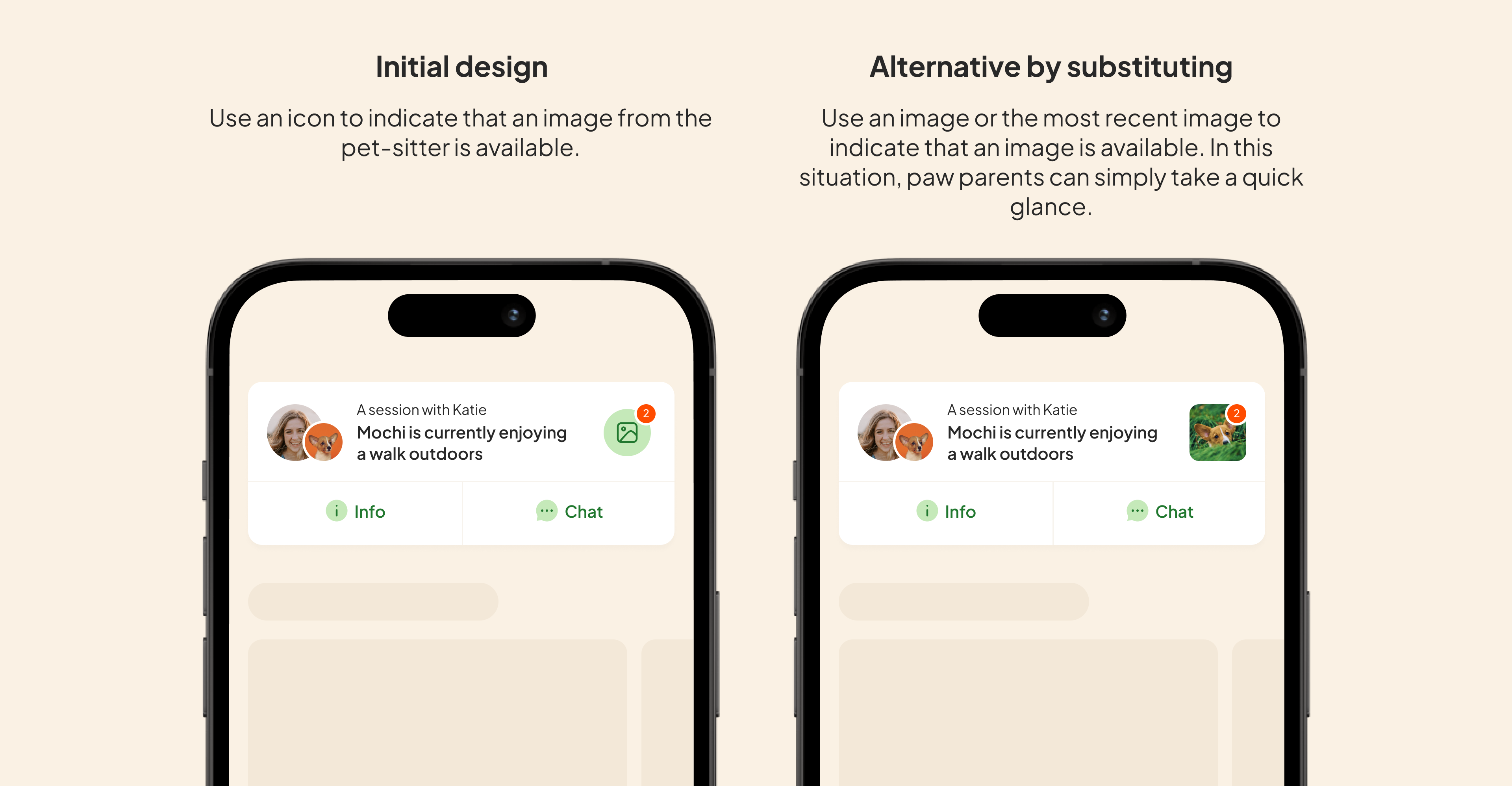
Initial idea: Use an icon to indicate that an image from the pet sitter is available.
Substitute: Use an image, or the most recent one, to show that an image is available. This way, paw parents can quickly get the information with just a glance.
[C]ombine
"Combine" means bringing different elements together to create something new.
Look for ways to mix parts from two different ideas to make something more exciting and effective.
Find opportunities where different pieces can work well together to develop better solutions.


When you combine elements, you might modify, substitute, or eliminate existing ones.
You’re not limited to using just one method for each alternative. One change can lead to another.
[A]dapt
Consider borrowing ideas or solutions from other fields and adapting them to your context.
For example, I take inspiration from a ride-hailing app to create an ongoing trip card, which can be similar to the pet-sitting session card.
Let’s take a look at the Lyft app.

Here’s what I’ve adapted from Lyft: I added a card fixed at the bottom and made it expandable.
It’s not a 100% copy, I’ve tailored it for my own use.

Instead of drawing inspiration from direct competitors, we can gather ideas from apps in different industries that address similar challenges.
[M]odify
Modifying involves making changes to existing elements to improve them or make them more suitable for a specific purpose.
Initial design: My original card design was flat, without any shadow.
Alternative by modifying: I made a small but crucial modification by adding a shadow, which gives the element a more elevated appearance and suggests it can be tapped. In this case, I can eliminate the arrow.
The modification doesn’t have to be major. I always believe that a small change can convey a different meaning.

[P]ut to another use
"Put to another use" suggests repurposing an existing element, feature, or idea for a different application than originally intended. This approach often uncovers new value or utility that may not have been initially obvious.
Initial idea: The original idea was to use the ongoing session card solely as an entry point to open the ongoing session detail screen.
Put to another use: I then repurposed it to serve as a quick information card before users explore more details.

[E]liminate
Identify and remove unnecessary elements from the design. Simplify the concept by eliminating features that don't significantly contribute to the overall value or user experience, resulting in cleaner, more efficient designs.
Initial idea: The arrow icon provides an indication that the card is tappable, signaling that more content is available.
Eliminate: Could it work without the arrow? Yes, if elevated card elements and green text consistently signify tappable items, that’s sufficient for user understanding.

Always look for opportunities to remove unnecessary details. I constantly remind myself that less is more.
However, if removing elements makes your design unclear, it's worth reconsidering.
[R]everse
Challenge usual ideas by flipping or rearranging elements to see if a new perspective or solution appears. For example, if your design mostly uses vertical scrolling, try imagining how it would look and work with horizontal scrolling.
Initial idea: I started by trying to make the card as small as possible on the homepage.
Reverse: Why not think differently? Make the container much larger so it can show all the important information on the home screen—since it's the most important thing when a session is ongoing.

Keep it flexible
There are no strict rules or a specific order for using these actions. You don't have to use all seven methods. In my experience, it's often messy; I usually mix two or three actions like modifying, substituting, and combining.
I might start by borrowing ideas or solutions from anywhere, and then adapt them to fit my needs.
Did you know you can also use this to structure how you communicate your idea?
When sharing your idea, these action words can help tell your story. For example:
"I started with this initial idea, encountered [issue], and then substituted [initial idea] with [new idea]."
"I adapted this idea from another app because it closely aligns with our case... [elaborate further]."
"I eliminated [what you've removed] because [the reasons]."
Finally…
Again, this doesn't mean we design like robots when exploring.
Most of the time, I don't even think about the methods; I just go with my gut. But if you're stuck and don't know where to start, this framework can help.
Did you enjoy this week's Design Buddy?
Show your appreciation by clicking the heart button ❤️ or spread the word to a friend, colleague, or fellow designer!