Design lessons from a $120M tech startup stumble
Reminders as timeless as our mom’s advice.
🕰️ Est. reading time: 4 minutes
In 2017, a new startup promised to change how we drink juice at home. With a stylish, high-tech product and $120 million in funding from top investors, success seemed certain.
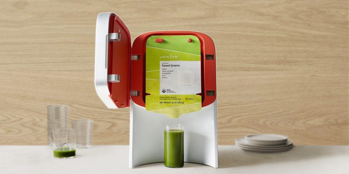
Enter Juicero, a Wi-Fi-connected juicer priced at $400, designed to make fresh, organic juice with just the push of a button. It came in a sleek, stylish machine that fit perfectly in any modern kitchen.
But even the best ideas can sometimes fail.
Juicero's story quickly became an example of what not to do in product design.
Design Buddy is a free publication supported by readers like you. Subscribe to have my next post delivered directly to your inbox.
Lesson #1: Know your problem inside out
"𝐈𝐟 𝐈 𝐡𝐚𝐝 𝐚𝐧 𝐡𝐨𝐮𝐫 𝐭𝐨 𝐬𝐨𝐥𝐯𝐞 𝐚 𝐩𝐫𝐨𝐛𝐥𝐞𝐦 𝐈'𝐝 𝐬𝐩𝐞𝐧𝐝 𝟓𝟓 𝐦𝐢𝐧𝐮𝐭𝐞𝐬 𝐭𝐡𝐢𝐧𝐤𝐢𝐧𝐠 𝐚𝐛𝐨𝐮𝐭 𝐭𝐡𝐞 𝐩𝐫𝐨𝐛𝐥𝐞𝐦 𝐚𝐧𝐝 𝟓 𝐦𝐢𝐧𝐮𝐭𝐞𝐬 𝐭𝐡𝐢𝐧𝐤𝐢𝐧𝐠 𝐚𝐛𝐨𝐮𝐭 𝐬𝐨𝐥𝐮𝐭𝐢𝐨𝐧𝐬." - Albert Einstein
Here's where Juicero went wrong: they created a solution for a problem that didn't really exist.
What's the main hassle of making juice at home?
It's probably the mess and cleanup.
Juicero thought they had solved this with their sealed pouches and high-tech press. But they missed an important point – people who buy juicers usually want to use their own fresh fruits and veggies, not pre-packaged ingredients.
Lessons:
Always take the time to truly understand the real problem your users face.
Don't just assume you know what they need.
Talk to them, observe them using similar products, and put yourself in their shoes. Remember, we're often not in our customers' shoes – our perspective as designers or product owners can be very different from theirs.
What seems like a great solution to us might not address their actual needs or preferences.
Lesson #2: Be intentional. Every feature should solve a problem
"𝐏𝐞𝐫𝐟𝐞𝐜𝐭𝐢𝐨𝐧 𝐢𝐬 𝐚𝐜𝐡𝐢𝐞𝐯𝐞𝐝, 𝐧𝐨𝐭 𝐰𝐡𝐞𝐧 𝐭𝐡𝐞𝐫𝐞 𝐢𝐬 𝐧𝐨𝐭𝐡𝐢𝐧𝐠 𝐦𝐨𝐫𝐞 𝐭𝐨 𝐚𝐝𝐝, 𝐛𝐮𝐭 𝐰𝐡𝐞𝐧 𝐭𝐡𝐞𝐫𝐞 𝐢𝐬 𝐧𝐨𝐭𝐡𝐢𝐧𝐠 𝐥𝐞𝐟𝐭 𝐭𝐨 𝐭𝐚𝐤𝐞 𝐚𝐰𝐚𝐲." - Antoine de Saint-Exupéry
Juicero fell into a common trap: the "more is better" bias. We often think that more features or options automatically make a product better.
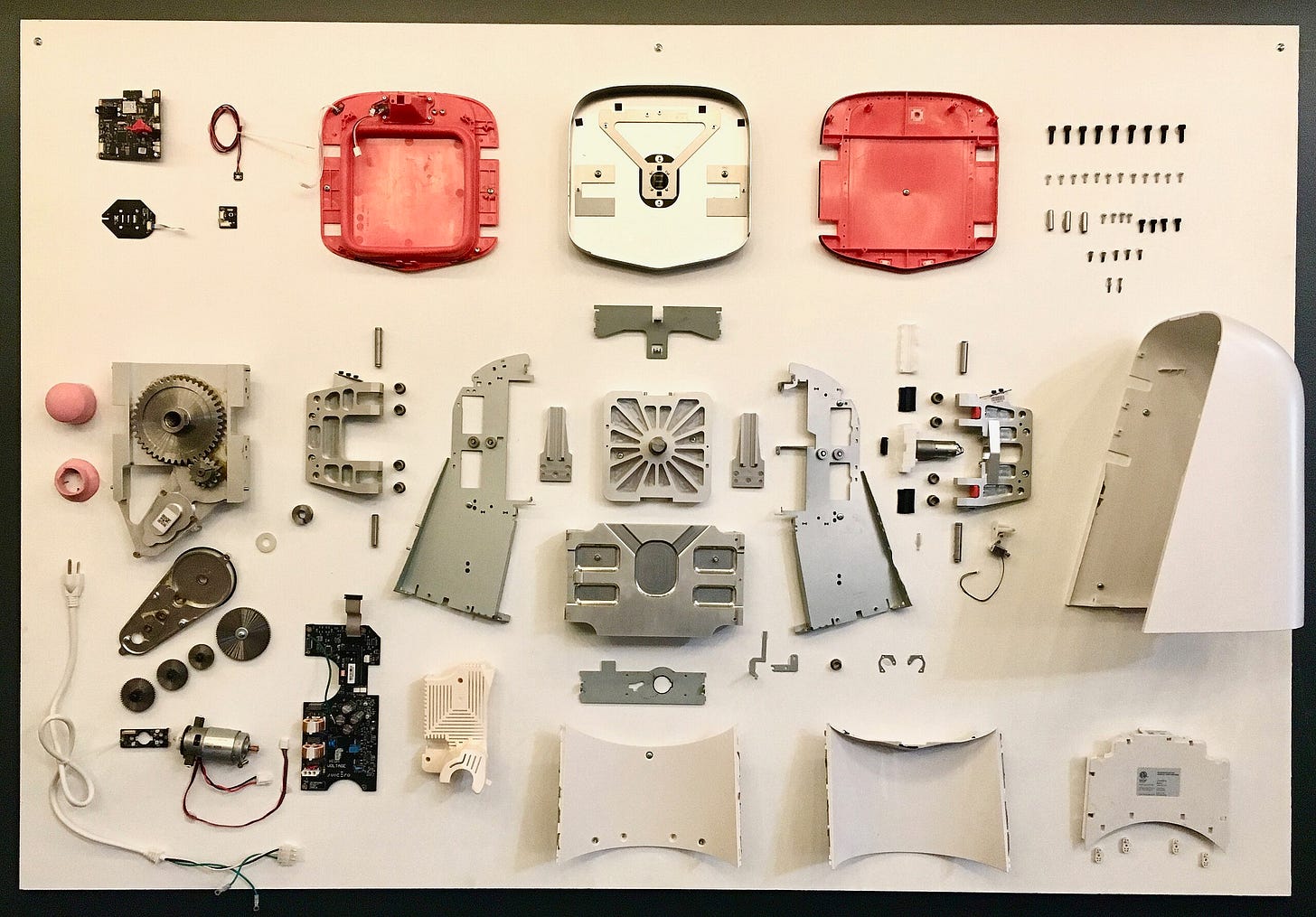
They went all out with their tech: Wi-Fi connectivity, QR codes, and a fancy touchscreen. But all this technology didn't actually make juicing any easier or better.
In fact, it made things more complicated. Users had to connect the machine to Wi-Fi, scan QR codes, and deal with software updates—just to make juice! Imagine being in a rush in the morning, only to find you need to update the software before you can get your juice.
The real shock came when customers realized they could squeeze the juice packs with their hands faster than using the machine.
This "more is better" approach didn't just fail to improve the user experience; it made things more complex and costly.
Lessons:
Don’t add features just because you can or because you think more is always better.
Every design element should solve a real problem or make the user experience better.
Even small details matter. Be intentional.
Always ask "why" – why are we adding this feature? Why does the user need it?

Lesson #3: Beauty isn't everything
"𝐅𝐨𝐫𝐦 𝐟𝐨𝐥𝐥𝐨𝐰𝐬 𝐟𝐮𝐧𝐜𝐭𝐢𝐨𝐧" - Louis Sullivan
One thing Juicero got right was its looks.
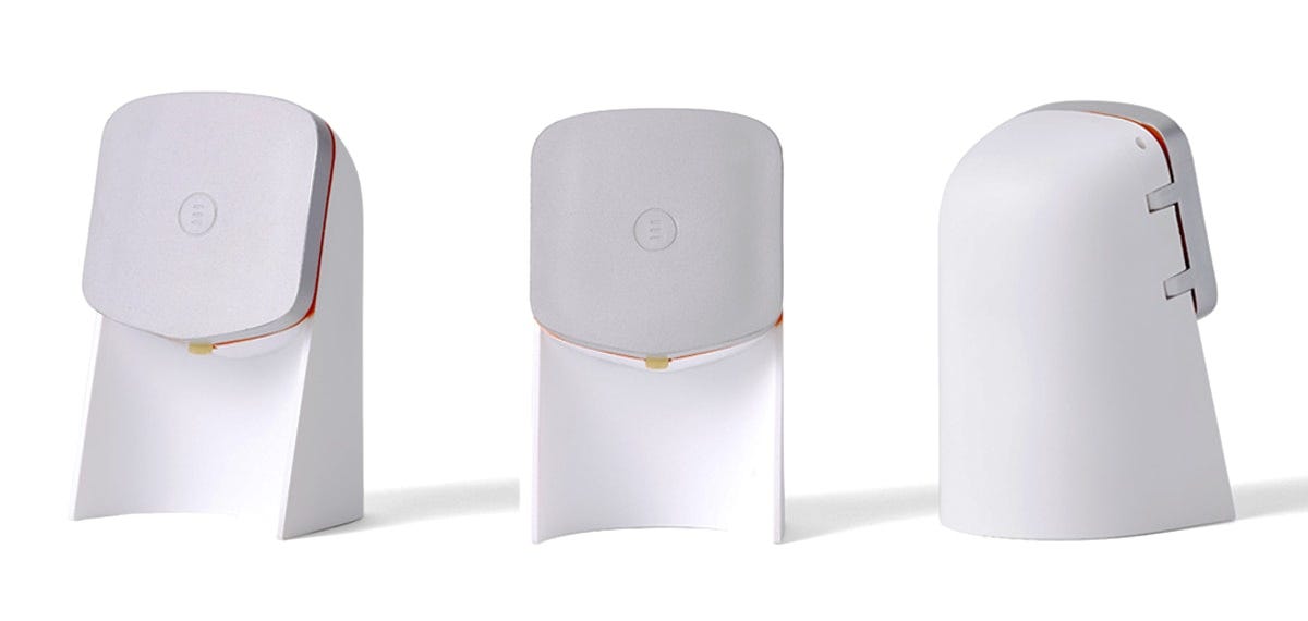
The machine was sleek, modern, and visually stunning. It looked like a piece of art in the kitchen, drawing admiring glances and compliments. From an aesthetic standpoint, Juicero nailed it.
But here’s the catch: while Juicero was beautifully designed, it fell short in function.
All that visual appeal couldn’t make up for the fact that the machine didn’t solve a real problem or work better than simpler alternatives.
As a designer, I often get excited about aesthetics first. Sometimes I focus too much on making something visually striking and forget about its practical purpose.
I know this doesn’t apply to every situation—sometimes you need to make the design look really good. However, this shouldn’t come at the expense of functionality and practicality.
Lessons:
A product needs to work well and be practical first, especially if it's meant for regular use by many people.
Remember: Form follows function.

A tale to remind
Juicero's story is a classic reminder that great design starts with truly understanding your users and their needs; this is fundamental. It’s about solving real problems, not creating a solution first and then searching for a problem to fit it.
We might get tired of hearing these reminders. They’re like timeless wisdom from our parents—repeated until they become second nature.
So, the next time you're designing something, remember this story.
So, the next time you’re designing something, remember this story and reflect with these questions:
Are we really solving people's problems?
Why are we adding this feature or detail? Why does the user need it?
Are we making things look good but hard to use? Why do we do this, and what could it cost us?
Your design buddy,
Thomas
Did you enjoy this week's Design Buddy?
Show your appreciation by clicking the heart button ❤️ or spread the word to a friend, colleague, or fellow designer!
Interesting readings on Substack:


