Are the possible actions clear enough for people to find and understand?
Minimizing the chance of inappropriate actions in the first place
If actions are not clear enough on a screen, people may still attempt to interact with the user interface and figure out how it works.
However, have you ever experienced frustration with a simple door?
Yes, a door. You pull when it should be pushed or vice versa. Eventually, you get through the door, but the experience can be unpleasant, particularly if you're in a hurry. You might repeat the same mistake, even if you know how to open that door.
The same principle applies to digital products. Have you ever felt frustrated with a system when purchasing, ordering a ticket, or ordering food? You wish you could avoid repeating the same experience in the future. You won't hesitate to switch if similar products are available.
As a designer, it is crucial to consider how people perceive possible actions on screens. Are the steps clear enough to find and understand on the first attempt? Are there any ambiguities?
Sometimes, what you consider acceptable and common may not align with users' mental models—their unique ways of seeing and understanding. I have been surprised on multiple occasions while observing users, discovering how their perceptions and thought processes differ from mine.
The fundamentals
When we interact with a product, we try to understand its functionality, operation, and available options.
Good products facilitate users in discovering how they work. They provide clear information on how people can interact with them, and there's a term for this concept. It's called "affordance," coined by J.J. Gibson, a psychologist who significantly contributed to understanding human perception.
Affordance
1 Affordance is a relationship between an object's properties and the agent's capabilities determining how the object could be used.
Don Norman
For example, a chair affords sitting. When you see a regular chair, you naturally think you can sit on it to support your body. However, this may not be the case for all chairs. Your brain will tell you that sitting on a child's seat is impossible, and even if you can, it wouldn't be comfortable. This is where affordance comes into play, as it helps determine the possible actions.
Why does the door fail? Because the door sends the wrong signal to people. A door with a pull handle implies that it should be pulled. Even though people know the door cannot be pulled, they still make the same mistake. This is because, by its nature, that door provides information that says, "Pull me, please!"
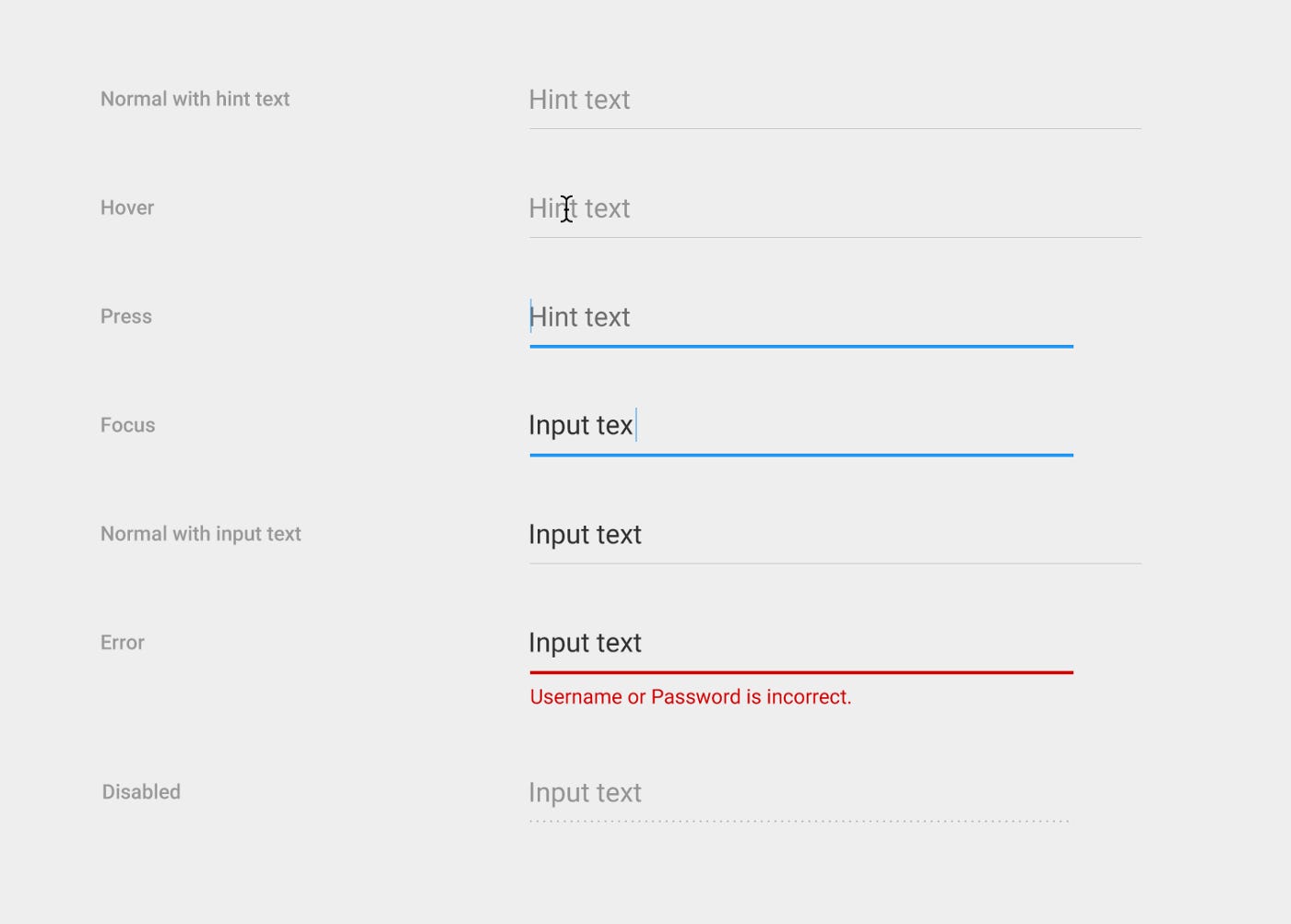
In product design, designing UI elements on the screen can also lead to users receiving the wrong signals. 2Do you remember when Google changed the input-field component in 2017 from a rectangle to an underline?
After conducting usability studies, it appeared minimal and sophisticated but underwent a makeover in 2019.
Some users didn’t know that they could interact with and click on the text field – It looked like an empty box. The line affordance under the old text fields was not clear to some users. The line was confused with a divider. The label and input were confused with body text, especially in dense compositions. – Susanna Zaraysky
They finally concluded the study involving around 600 participants, and here’s the result.
Signifier
Signifiers communicate information through words or graphics to help people understand the possible actions, their purpose, and what is happening. Signifiers make the actions clear and apparent.
How do people quickly fix the elusive door? By adding a sign on the door. Although it doesn't solve the underlying problem, the sign will help make the desired action apparent.
How about in-screen design?
Remember this “slide to unlock”?
Let’s jump into the current lock screen with Face ID. If you haven't set it up, you will see a sign that says, "swipe up to unlock."
Labels on the bottom navigation bar.
I was curious and audited 50 apps from medium to giant tech companies (thanks to Mobbin!) to determine which apps have labels on the bottom navigation bar and which ones do not.
Most apps use labels on their navigation bar, while around 20% do not. I assumed apps without labels would be easy to understand, but they are not! Let's take a look at some examples.
Note: I'm not suggesting that you should always use labels on your bottom navigation bar.
I want you to reflect on the following question: "In my case, should I use labels? If so, why? And if not, why?"
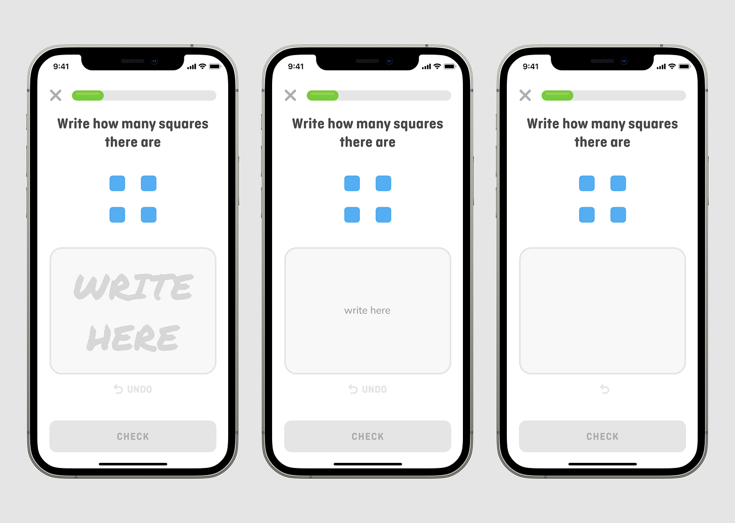
Another example is from Duolingo Math. Which one do you think has better signifiers
Should it have the label "write here"? If yes, which version?
Is it necessary for the circular arrow to have the label "undo"?
Version A is the original version. Handwriting provides an even more apparent sign that using your finger to write the answer is possible. Although I wasn't sure – should I write "4" or "four"?
The "undo" text provides additional clarity about the action, especially since there is still room for a label.
Improving affordance and finding the right balance in using signifiers
The first step is always to remember that you are not your users.
The first step is always to remember that you are not your users. Even though you use your product, you could be biased because you've seen your design a thousand times.
So, what can you do with your design?
To improve affordance:
Reassess every UI element you design, such as buttons, texts, input fields, dividers, etc. Reflect on this question: Would people smoothly and effortlessly find and understand them on the first try? Why do you think that way?
Try different components and come up with alternatives. Would any other components make it easier to find and understand possible actions?
If you have doubts, test it. If you are working on a novel concept, test it. Test it with your colleagues. Learn from their perspectives. Understand how people would interact with it. Gain more confidence by testing it with actual users.
To find the right balance in using signifiers:
Check every label and sign on the screens you have designed. Are the labels necessary? If there were no labels, would users still be able to search for and understand possible actions? Remember: people rely on clues, and signs make possible actions more perceptible.
Evaluate if you need to add any signs. Does any part of your design require signifiers to communicate its meaning more clearly? Why do you think that?
Sometimes signifiers fail to fulfill their function and do not effectively communicate information. How can these signifiers be replaced to improve their ability to convey meaning?
If you choose not to include signifiers where users might get confused, why is that?
“Designers should strive to minimize the chance of inappropriate actions in the first place by using affordances, signifiers, good mapping, and constraints to guide the actions.”
Donald A. Norman, The Design of Everyday Things
Norman, Don. The Design of Everyday Things: Revised and Expanded Edition. Basic Books. Kindle Edition.


