
How AI can help designers analyze the reasoning behind design decisions
It can… with caveats.

As I said in a post earlier this year, I want to spend more time exploring the relationship between AI, especially generative AI, and product design: what AI can do, what tools are out there, and everything in between. Inspired by Sal Khan’s TED talk, how AI could save (not destroy) education1, I’m exploring how AI could empower product designer.
One use case I want to dig into is how AI can help me expand my knowledge, uncovering the reasoning behind design decisions that might be rooted in the psychology of design, visual principles, or something else.
That said, you’ve got to be careful.
Language models like GPT work purely on statistics. What you see is a model generating words for you, but in reality, it’s generating tokens, converting them into numbers, and analyzing the statistical relationships between these numbers to produce text that makes sense2. If you’ve ever had a language model give you incorrect answers, it’s simply a statistical miscalculation.
And… conducting analysis with a language model isn’t a replacement for reading case studies. Case studies let you experience the story firsthand—you see the real-world context, the challenges, and the trade-offs. AI models don’t. They just generate responses based on patterns in the data they were trained on. They don’t have consciousness or an actual understanding of facts3.
But hey… think of any results from the language model as a 🕵️ detective’s lead! A starting point—something to investigate further, connect the dots, and dive deeper down the rabbit hole.
Okay, that's enough introduction. With that in mind, I want to walk through my exploration of using AI to analyze and understand design decisions.
Note: I wanted to keep this exploration tool-agnostic. I use ChatGPT, but you can use any language model as long as it supports multimodal input. I’ll explore comparisons between language models like Claude, Gemini, and DeepSeek.

Design Buddy is a free publication supported by readers like you. Subscribe to have my next post delivered directly to your inbox.
Analyzing a single UI screen
As we utilize multimodal capabilities4, we’ll upload images and write text as prompts.
In this experiment, I used the cascading paywall screen from the Headway app5.

🤖 Prompt: Analyze the [screen name] design through the lens of [behavioral psychology and visual principles]. For each component, assess its impact on user perception, decision-making, usability, engagement, and potential friction points

Mention the screen name to add clarity. If you don’t know the standard name, just be descriptive or leave it blank.
You can adjust the lens to focus on just one or two perspectives, depending on what you want to analyze.
Behavioral Psychology → How users think and behave. It focuses on cognitive biases, heuristics, and emotional triggers that influence decision-making. I’d recommend this exhaustive list6 if you want to learn more.
Visual Principles → Fundamental design rules that make an interface aesthetically pleasing, easy to navigate, and visually effective, covering contrast, hierarchy, gestalt principles, and more.
And for each component analysis, it covers:
User Perception – How users interpret and emotionally respond to the element.
Decision-Making – The cognitive biases and heuristics influencing user choices.
Usability – Clarity, readability, and accessibility in interaction.
Engagement – How the element maintains attention and encourages action.
Friction Points – Potential barriers, confusion, or resistance caused by the design.
Tip: You can add ‘Format the output in a table and necessary emojis.’

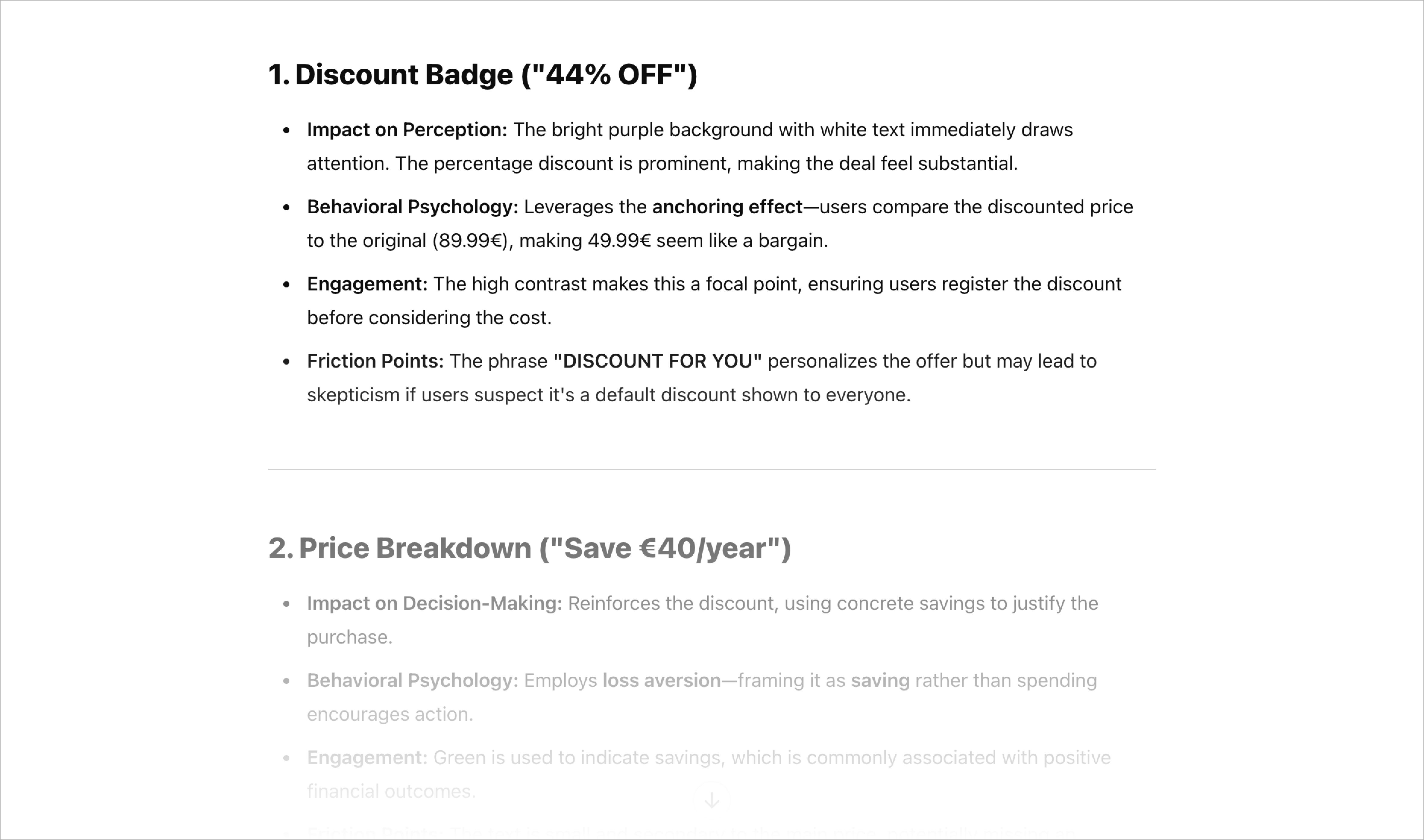
As you can see, you get a list of elements from the screen you upload, along with the reasoning behind them. Again, use this as a starting point. Check if the cognitive biases described are actually true and applied appropriately. Be critical: does the reasoning make sense in context?
To be honest, most of the time, I hold myself back from explaining concepts like loss aversion or the paradox of choice to my stakeholders—it sounds too textbook. I remember people just going silent when I said ‘progressive disclosure.’ 🫠
Instead, I communicate it in a way that’s practical, more relatable. For example, instead of saying paradox of choice, I’d just explain that people might feel overwhelmed when faced with too many options.
Add more contexts
Providing more context is encouraged to achieve more accurate and reliable responses.
On the first try, without any context, one of the recommendations was a short bullet-point list of features and a value proposition heading for product value reinforcement.
The language model didn’t recognize that this wasn’t a standalone screen. Before reaching this point, the user had already gone through a long onboarding flow, talking about its features and benefits.
Additionally, the discounted pricing follows a cascading pricing strategy, triggered after the user skips upgrading on the original paywall.
So, adding context could be helpful.
In this case, when adding context, we can use the same prompt as before and apply the delimiters technique to give clear boundaries so that the AI won’t be confused. I love using HTML tags, but you can also use """ """, << >>, or [ ]7.
I will try adding some context about the app and the user journey. Feel free to add any additional context as needed.
🤖 Prompt: Follow the same prompt as above…
<about the app>Headway is the #1 most downloaded book summary app, designed to help users achieve self-growth by reading or listening to key ideas from bestselling nonfiction books in under 15 minutes. Users can set personal development goals such as increasing productivity, improving relationships, building confidence, and achieving life balance.</about the app>
<user journey>I have included the full onboarding flow preceding the discounted pricing screen.</user journey>
Line up the screenshots, then upload them.


Did it still give me the same recommendation (a short bullet-point list of features…)? Short answer: No.
I didn't include any screenshots due to Substack's length limit, in fact, I even had to remove some of the pictures I had added.
Try running the same prompt in a new chat to see how consistent the answers are
As I've explained how language models work, they may hallucinate8. It's worth running the same prompt in a new chat at least twice to see if the model generates consistent information.

You can see that they gave different answers. It's evident that you need to be cautious when analyzing UI screens with language models.
The bullet formats are different.
The right version doesn’t seem appropriate for using the anchoring effect method. However, the left version also doesn’t fully apply the anchoring effect, as it should focus more on the discount badge element.
The right version discusses the endowment effect, while the left one does not.
The right version highlights the placement of the discount.
There are different potential frictions.
And more…
Analyze it as a whole rather than focusing on each component individually
Although examining the reasoning behind each component might be useful, there is, of course, some interdependence between components.
My quick observation: The whole analysis feels less prone to hallucination compared to each component analysis. What's apparent is that it produces less analysis and uses fewer words. Another thing I noticed in the component-by-component analysis is that the reasoning isn’t always coherent between the top and bottom components. I assume AI reads the screen from top to bottom rather than analyzing components in a way that jumps between them.
Try removing "For each component"
🤖 Prompt: Analyze the discounted paywall design through the lens of behavioral psychology and visual principles.
For each component,Assess its impact on user perception, decision-making, usability, engagement, and potential friction points.

Ask follow-up critical questions
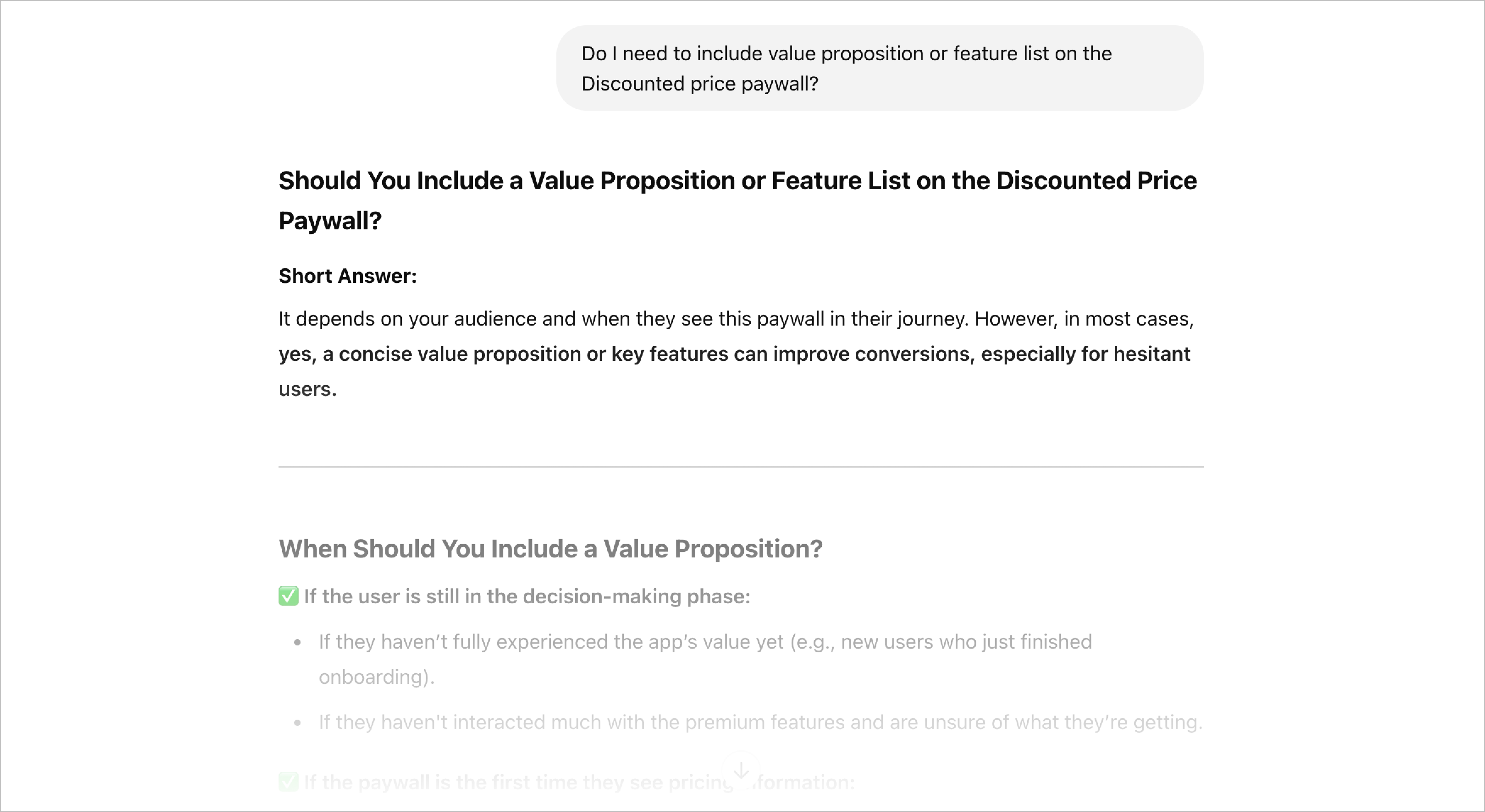
Ask more questions to dig deeper. Based on the result above, after providing more context on the user journey, I’d ask: "Do I still need to include a value proposition or a feature list on the discounted price paywall?"
Here’s what I got:
I’d ask further questions, such as:
Does the absence of an explicit deadline lead to indecision, or does it reduce pressure on users?
I feel like the gray text doesn't have enough contrast to be easily readable. Any specific reason?
Interesting that the discount percentage is 44%. Any specific reason?
Again and again: be critical of their answers.
Tip: Try also with the web search to gather sources from the internet.

Final thoughts
Of course, it’s a great tool to help me expand my thinking real quick. Although, with a caveat—use it as a starting point. Be critical of consuming information.
What do you think?
Until next time!
Cheers,
Thomas
You can show your support by clicking the heart button ❤️ or sharing this with a friend, colleague, or fellow designer! It helps me spread this newsletter and reach more people. Thank you!

It's becoming clear that with all the brain and consciousness theories out there, the proof will be in the pudding. By this I mean, can any particular theory be used to create a human adult level conscious machine. My bet is on the late Gerald Edelman's Extended Theory of Neuronal Group Selection. The lead group in robotics based on this theory is the Neurorobotics Lab at UC at Irvine. Dr. Edelman distinguished between primary consciousness, which came first in evolution, and that humans share with other conscious animals, and higher order consciousness, which came to only humans with the acquisition of language. A machine with only primary consciousness will probably have to come first.
What I find special about the TNGS is the Darwin series of automata created at the Neurosciences Institute by Dr. Edelman and his colleagues in the 1990's and 2000's. These machines perform in the real world, not in a restricted simulated world, and display convincing physical behavior indicative of higher psychological functions necessary for consciousness, such as perceptual categorization, memory, and learning. They are based on realistic models of the parts of the biological brain that the theory claims subserve these functions. The extended TNGS allows for the emergence of consciousness based only on further evolutionary development of the brain areas responsible for these functions, in a parsimonious way. No other research I've encountered is anywhere near as convincing.
I post because on almost every video and article about the brain and consciousness that I encounter, the attitude seems to be that we still know next to nothing about how the brain and consciousness work; that there's lots of data but no unifying theory. I believe the extended TNGS is that theory. My motivation is to keep that theory in front of the public. And obviously, I consider it the route to a truly conscious machine, primary and higher-order.
My advice to people who want to create a conscious machine is to seriously ground themselves in the extended TNGS and the Darwin automata first, and proceed from there, by applying to Jeff Krichmar's lab at UC Irvine, possibly. Dr. Edelman's roadmap to a conscious machine is at https://arxiv.org/abs/2105.10461, and here is a video of Jeff Krichmar talking about some of the Darwin automata, https://www.youtube.com/watch?v=J7Uh9phc1Ow